Client Story · Fitness coaching
Selling conviction: the landing page we built for Gym Church
Gym Church doesn't sell a gym membership. It sells a 12-week men's transformation program — strength training and discipline fused with a faith-driven message, run by coach Nick. The line at the centre of it is blunt: faith without works is dead. A page selling that can't whisper. It has to carry the same conviction the program demands.
The starting point
Most fitness landing pages look the same: bright, rounded, friendly, vaguely motivational. That tone is fine for a casual sign-up — but it actively works against a high-intensity, faith-led men's program. The wrong men click, the right men don't feel spoken to, and the offer gets diluted before anyone reads a word.
Nick had something most founders don't: he already knew exactly how to talk to his men. It was all there in his video scripts — the cadence, the challenge, the conviction. The problem wasn't the message. It was that nothing online matched it. The job was to take what he already says on camera and make a page hit just as hard.
A page built from the founder's own words
So that's where we started — not with a copywriting template, but with Nick's actual scripts. We wrote the landing page from his real video scripts, which means the words on the page sound like the man behind the program, not an agency guessing at his voice. For an offer that runs on belief and personal authority, that consistency isn't a nice-to-have. It's the whole sell.
When the offer is built on conviction, the copy can't sound like anyone but the founder. The page has to talk the way the coach talks.
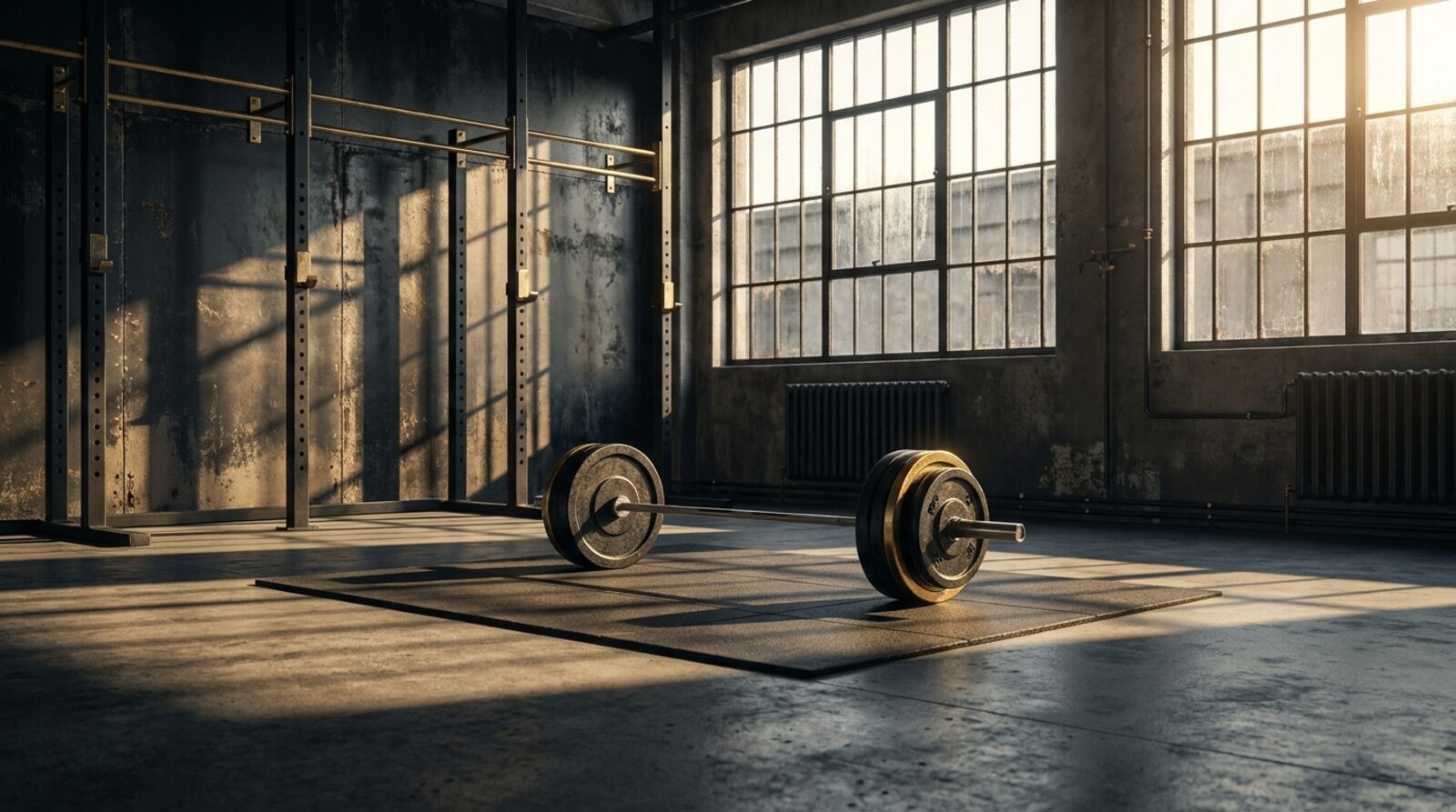
Dark, gold and heavy on purpose
The design follows the message. We went dark and gold with heavy type — a look that reads as serious and earned rather than soft and aspirational. Every section carries one idea at a time and builds toward a single decision, instead of fanning attention across a dozen competing call-outs. The page isn't trying to be liked. It's trying to be believed.
Making the apply decision unavoidable
A landing page can win the argument and still lose the application if the next step is hard to find. So we made applying impossible to lose. A rising apply bar keeps the call to action within reach as the reader scrolls, and a scroll-aware nav adapts as they move down the page. The moment the message lands, applying is one tap away — not a scroll back to the top.
We also presented three concept angles in an on-brand chooser, so Nick could see different directions for the page and choose the one that felt most like Gym Church before we built it out.
The result
Gym Church now has a landing page that matches the intensity of the program and drives applications for the 12-week cohort. It looks the way the program feels, it reads the way the coach talks, and it pushes the right men toward the one action that matters — applying.
- High-conviction VSL landing page in a dark-and-gold, heavy-type look
- Copy written from the founder's real video scripts
- Rising apply bar and scroll-aware nav keeping the application always in reach
- Three concept angles presented in an on-brand chooser
Want a landing page like Gym Church's?
We build the page, the copy and the apply funnel. Live in 4 days, month to month, same price forever.
Request a demo See the full case study