Client Story · Branding studio
When the website has to be the brand: building Malone Co Studio
Most businesses can get away with a website that describes what they do. A branding studio can't. When your entire value is taste — the judgement to look at a brand and realign it — your own site is the first and loudest piece of evidence. If it doesn't look the part, nothing you write will rescue it.
That was the challenge with Malone Co Studio. It's a boutique branding studio led by Justine, built around a signature brand audit and brand-voice and palette work. The proposition is sharp: two hours that realign your brand. Our job was to make a website that earned that promise on sight.
The starting point
A studio like Malone Co lives or dies on perception. The work is considered, editorial and quietly confident — but a website has to carry that feeling from the very first scroll, or a prospective client subtly downgrades their estimate of the studio before they ever read about the offer. The brand audit was clearly the hero, but it needed a site built to lead people toward it, not a generic services page that let it get lost.
A website that looks like the work it sells
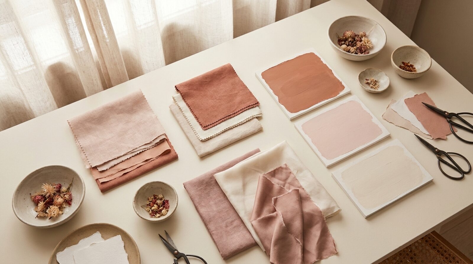
So we didn't start with features. We started with feel. Malone Co's site is built on a warm, cream-editorial palette with generous space and typography that does the talking. The tone of voice is the studio's own — calm, deliberate, words-first — so the design itself becomes the first proof of competence. Before a visitor reads a single claim, the page has already made the case.
For a branding studio, the website isn't where you describe the work. It is the work — the first sample a client ever sees.
This is the part a lot of agencies skip. It's tempting to bolt a brand onto a stock template and call it done. For a studio whose product is brand, that gap shows instantly. We treated every detail — spacing, type, rhythm, restraint — as part of the pitch.
Built around one offer
The other half of the build was commercial. A beautiful site that doesn't move people toward an action is just a portfolio. So we made the signature brand audit the spine of the experience — framed as a tight, two-hour session that realigns a brand's voice and palette, and positioned so the whole site leans toward booking it. The design carries the taste; the structure carries the conversion.
Three directions, one chooser
Because this is a studio that thinks in directions, we presented our work the same way. We built three distinct concept directions and laid them out in an on-brand chooser, so Justine could see the range, compare the angles, and select the one to build on. Each version was self-contained and each stayed true to the Malone Co feel — a body of work to choose from, not a single take-it-or-leave-it draft.
The result
Malone Co Studio now has a website that looks like the work it sells: editorial, considered, and focused on the one thing that matters commercially — the audit offer. It signals taste before a word is read and routes attention straight to the booking. The studio's own standards, met by its own site:
- Warm, cream-editorial design with the studio's own voice and palette
- Structured around the signature brand-audit offer to drive bookings
- Three concept directions presented in an on-brand chooser
- Built and hosted on the Scalus stack — fast, secure, always on
The best advertisement for a branding studio is a brand done well. Now Malone Co's own brand is exactly that.
Want a system like Malone Co's for your business?
We build the website, the lead flow and the dashboard. Live in 4 days, month to month, same price forever.
Request a demo See the full case study