Client Story · Luxury builder
Building a website that's as considered as the build itself: Prolifica
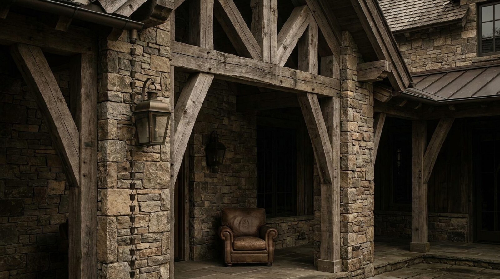
Prolifica Building Co work to a single line: Every detail, considered. They're a high-end residential builder specialising in heritage restoration and architectural additions across Melbourne and the Mornington Peninsula — the kind of work where the difference between good and exceptional lives in a shadow line, a reveal, a join you're not supposed to notice. The challenge with a builder like this was never the quality. It was getting a website to carry it.
The starting point
Craft at this level is hard to communicate online. A high-value client recognises it instantly in a finished room, but a standard trade website flattens all of it into a services list, a stock-photo hero and a contact form. For a heritage and architectural builder, that's a quiet leak: the very clients you want — the ones commissioning a considered restoration or a serious addition — judge you on taste before they ever pick up the phone. An average web presence doesn't just under-sell the work; it filters out the buyers who'd value it most.
So the brief was simple to say and hard to do: make the website feel like the work. Considered. Restrained. Premium without shouting about it.
A magazine, not a menu
We built the site as an editorial, image-first experience. A glassy black canvas, a magazine layout and a deliberately words-first structure let the photography of finished projects do the talking — each one framed like an editorial spread rather than a gallery thumbnail. Space is part of the design. Nothing is crowded, because nothing in Prolifica's work is.
The effect is that the site reads less like a builder's website and more like a publication — the sort of thing an architect or a discerning homeowner would actually want to linger in.
Words that earn their place
For a builder this considered, copy can't be filler. We led with the brand line — Every detail, considered — and wrote the site around the craft itself: the restraint, the heritage sensitivity, the discipline of an architectural addition done right. The tone is quiet and confident, the way the best builders talk about their own work when they're not trying to impress you.
For a premium brand, the website isn't a brochure for the work — it's the first sample of it. If it doesn't feel considered, the visitor assumes the build won't be either.
Three directions, one identity
Rather than hand over a single take and hope it landed, we presented three distinct concept directions in an on-brand chooser — The Folio, The Atelier and The Commission. Each is a different lens on the same premium identity, and seeing them side by side let Prolifica understand the range of where the brand could live and choose the direction that felt most like them. It turns a subjective conversation about taste into a clear, confident decision.
The result
Prolifica now has a premium digital presence that matches the quality of their builds — an editorial experience that puts the work front and centre and positions the company for exactly the high-value heritage and architectural clients it's built for. The site doesn't try to out-talk the craft. It gets out of the way and lets it speak.
- An editorial, image-first website — glassy black, magazine layout, words-first
- Copy written around the craft, led by Every detail, considered
- Three concept directions to choose from: The Folio, The Atelier, The Commission
- Built and hosted on the Scalus stack — fast, secure, always online
Want a presence like Prolifica's for your business?
We build the website, the lead flow and the dashboard. Live in 4 days, month to month, same price forever.
Request a demo See the full case study