Client Story · Tattoo studio
Why a tattoo studio's website should be a gallery, not a brochure
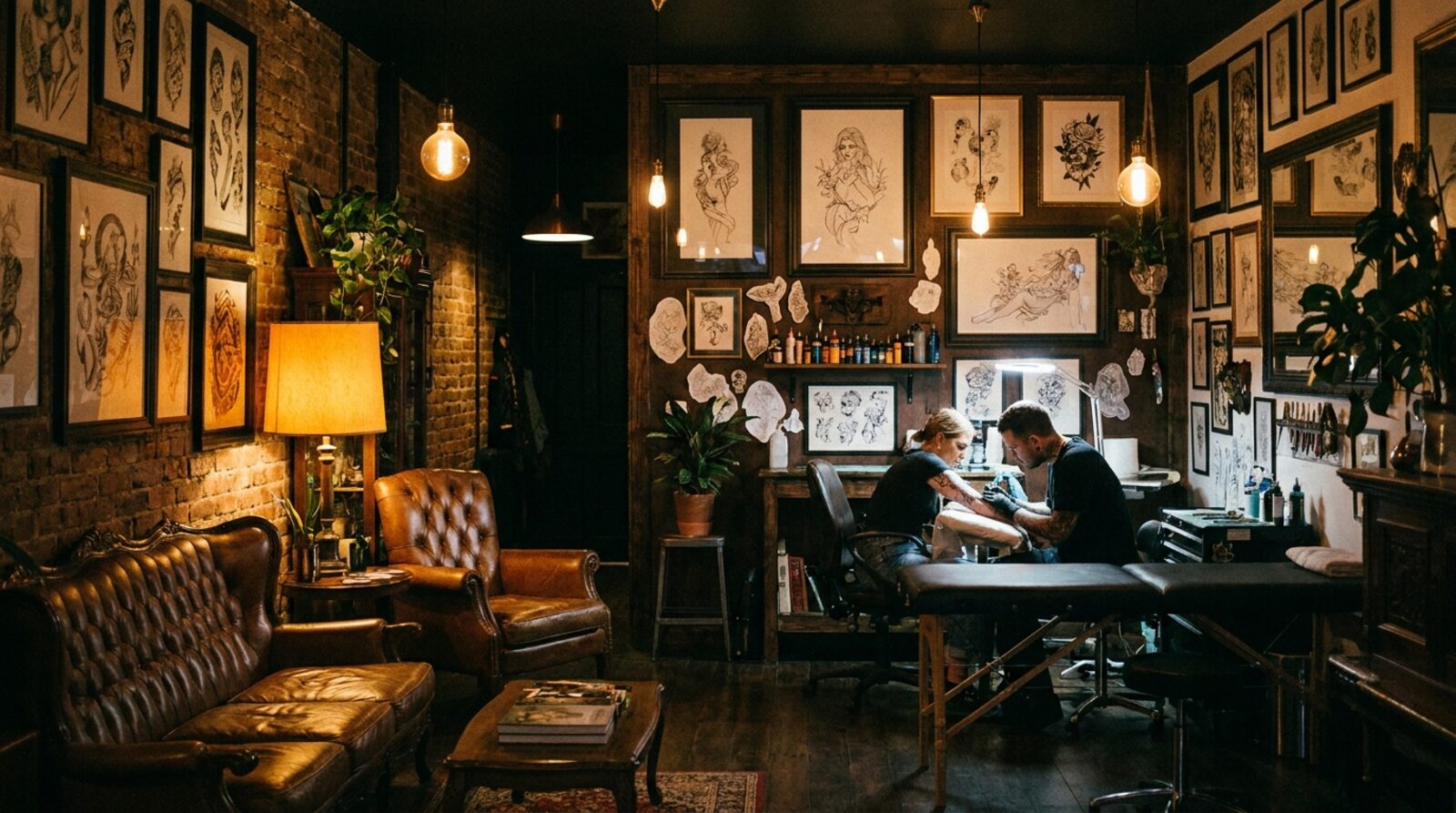
Full Moon Tattoos has a simple promise: Premium Ink. Art for Life. They've been doing custom work on Chapel Street since 2008 — traditional through to modern, all of it permanent, all of it personal. When someone is choosing where to get inked, they aren't reading paragraphs. They're scrolling photos, deciding whether a studio can do their idea justice. So we built a website that understands that, and gets out of the way.
The starting point
A custom tattoo is a high-trust decision. It's on you forever, you're spending real money, and you're handing creative control to an artist you've often never met. The single biggest thing that builds that trust online is the work itself — finished pieces, healed and photographed well. Like a lot of studios, Full Moon had the talent and the back catalogue, but their site wasn't letting the art lead. It looked like a brochure when it needed to feel like a gallery.
A site that puts the ink first
We built the whole experience around the craft, in a dark, gallery-style treatment that frames the tattoos as art rather than a service you order. The studio's story and the parlour get their own space, but everything is built to push the eye toward the work:
- A dark, gallery-first design that treats tattoos as art
- The studio's parlour story — who Full Moon are and how they work
- "The work" — a portfolio of the artists' range, traditional to modern
- A guided booking flow from inspiration to enquiry
- A session-prep section so clients arrive ready for the chair
It's fast, secure and always online, built and hosted on the Scalus stack — and crucially, it looks like it belongs to a serious studio the moment it loads.
"The work" does the selling
The centrepiece is the portfolio. For a tattoo studio, this is the most important page on the site — it's where a maybe becomes a booking. By giving the artists' range room to breathe and leading with it, the site lets prospective clients do what they came to do: look, picture their own piece, and decide. The copy supports the art; it never tries to replace it.
For a studio whose product is permanent, the website's only job is to let the work speak — then make the next step effortless.
From browsing to booked
Inspiration is only useful if it has somewhere to go. So we added a guided booking flow that walks someone from "I want something like that" to a real enquiry, without the friction that loses people halfway. And because a tattoo session goes better when everyone's prepared, we built a dedicated session-prep section — what to do before you sit, what to expect — so clients turn up ready and artists spend their time on the art, not the admin.
The result
Full Moon Tattoos now has a portfolio-led site that showcases the artists' work and books custom sessions. The concept directions were presented in an on-brand chooser so the studio could land on the look that felt most like them — then we built it. The result is a digital front door that matches the standard of the studio behind it.
Want a system like Full Moon's for your business?
We build the website, the lead flow and the dashboard. Live in 4 days, month to month, same price forever.
Request a demo See the full case study